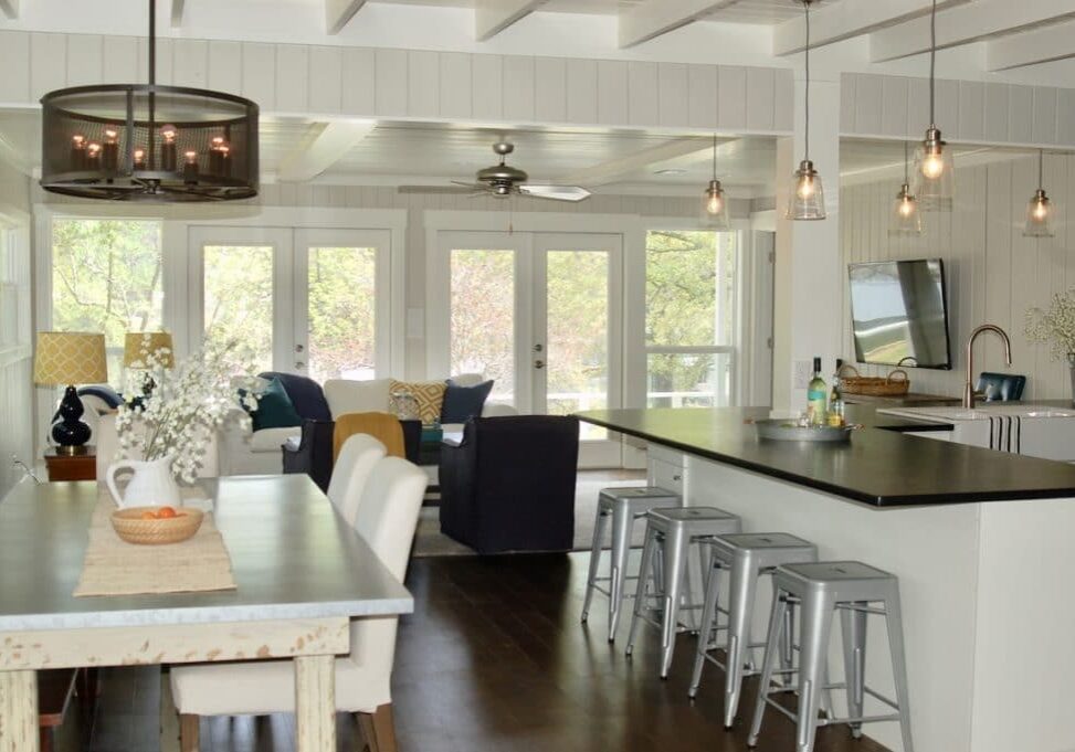
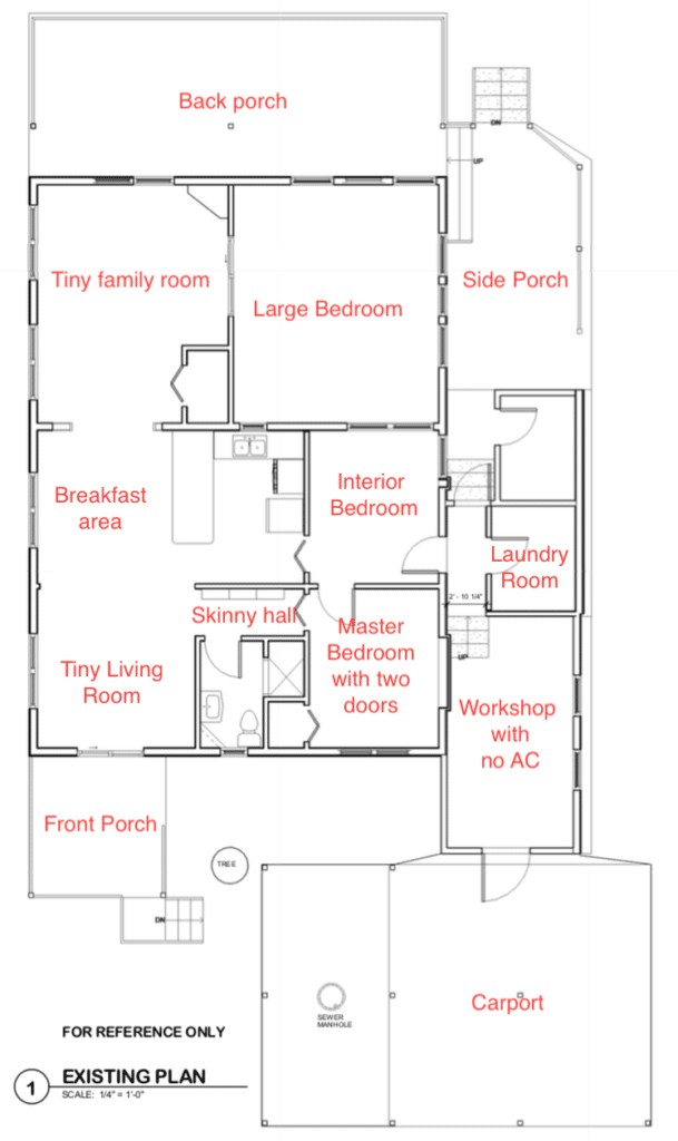
We bought the ugliest house in the neighborhood. It was on the lake so I looked past the ugly, but I refused to spend one night in the house before the remodel. This fixer upper needed a kitchen and bath refresh – fast! If you remember from my previous post Lake House Fixer Upper the floor plan was strange to say the least:
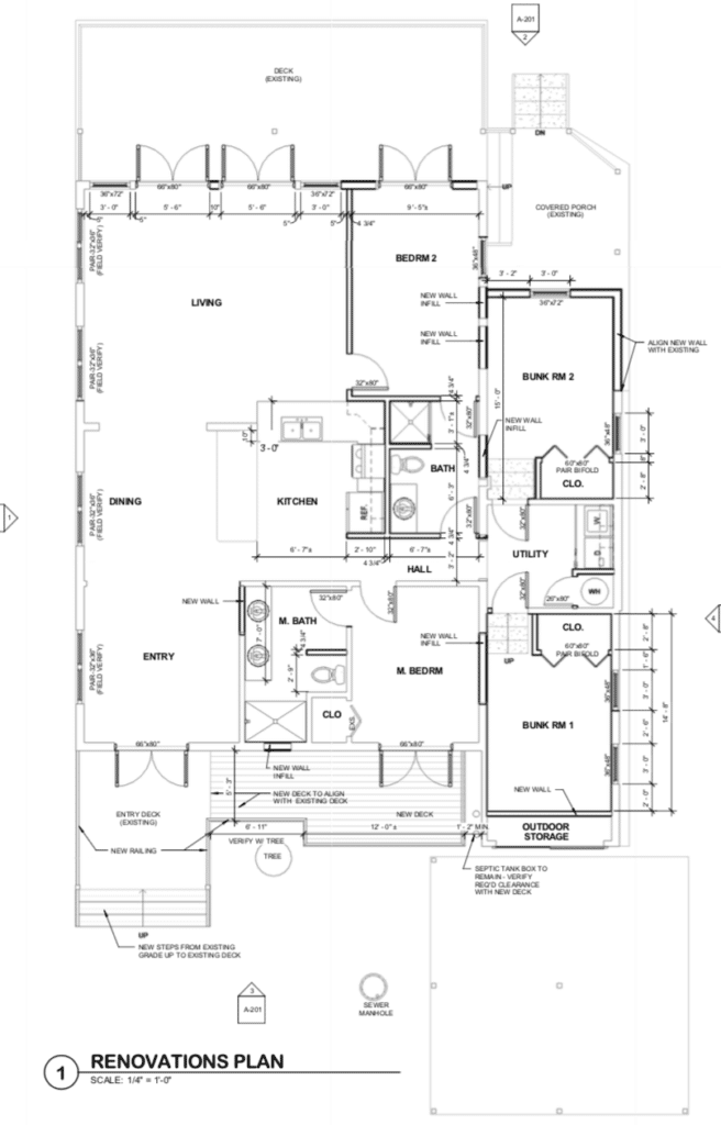
Here is the new floorplan with the help of my fabulous architect Lori Mitchell:
This was my kitchen before the remodel:
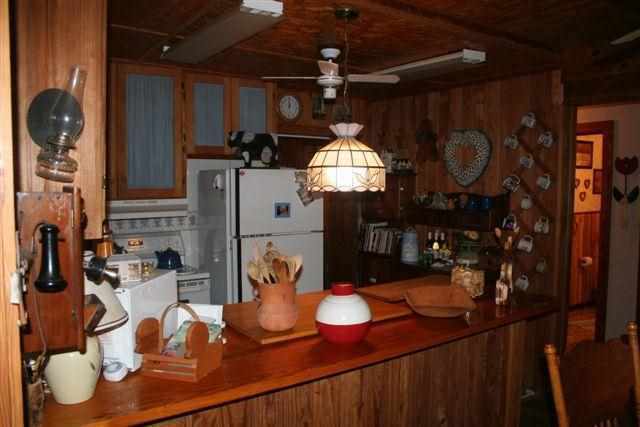
Don’t you love the fake Tiffany Chandelier with both of the fluorescent lights AND the ceiling fan in this tiny kitchen? To open the kitchen to the family room we had to say goodbye to the window over the sink that looked into the back bedroom – ha, ha! We removed all the lighting and fan and raised the ceiling by removing the plywood and beams. Then we added recessed lighting and pendants over the bar. We installed white cabinets, a white farmhouse sink and black leathered granite to create a classic look.
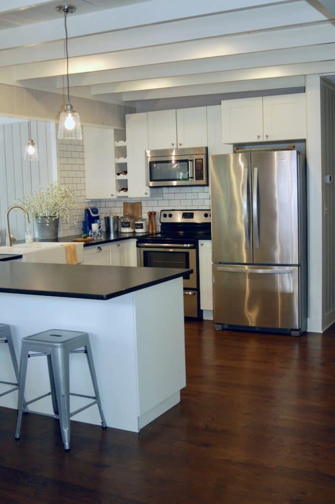
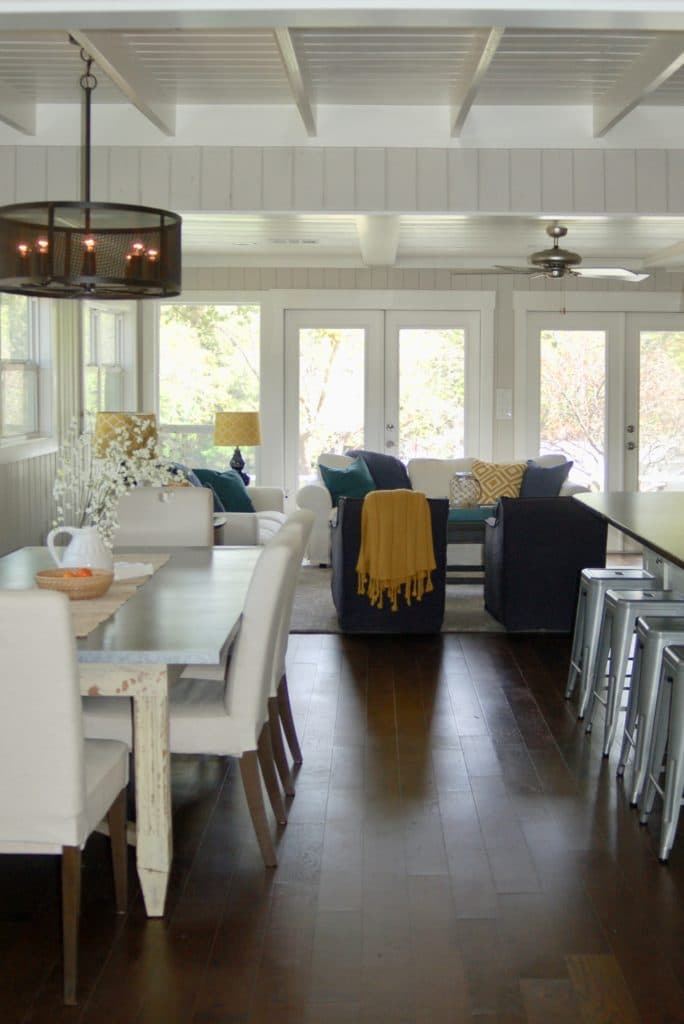
We opened up the kitchen by pushing back the wall where the refrigerator was. This made the kitchen and living room much bigger. We wrapped the counter around the support beam which created room for 8 metal bar stools – perfect for wet bottoms!
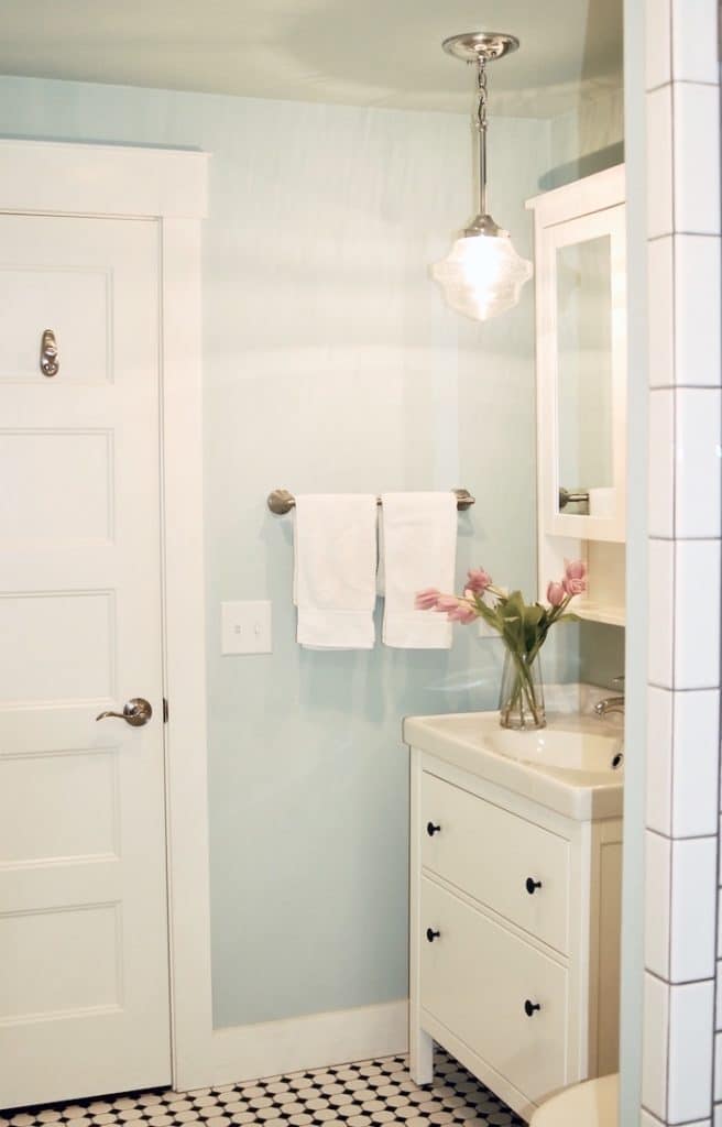
When we enlarged the kitchen it shrunk the bedroom directly behind it. We turned that into a second bathroom. We used the Hemnes sink and medicine cabinet from IKEA. The black and white tile is a classic and timeless pattern.
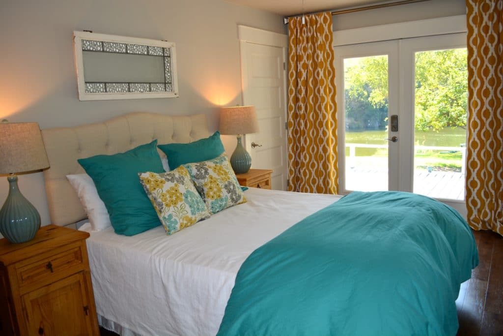
Guest Room Before and After:
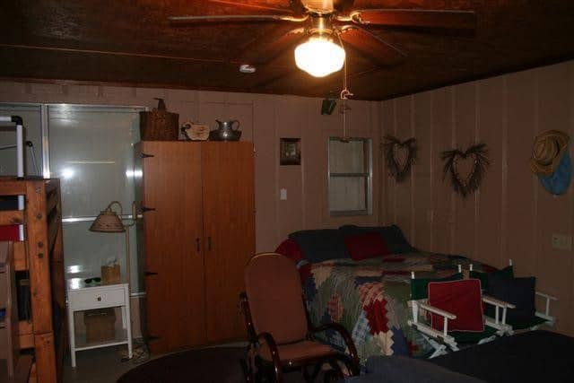
The new guest bedroom below is a little smaller because we enlarged the living room, but we felt that it was more important to have a larger living space than a huge bedroom with interior windows that looked into the kitchen and another bedroom! We added french doors that open to the back deck and look out to the lake to make the room feel more spacious.
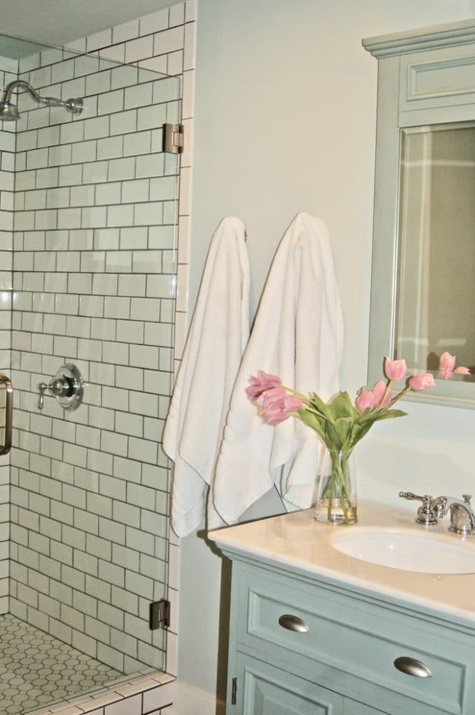
Master Bedroom and Bath Before and After:
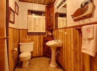
This was the only bathroom in the house and it had fake vinyl paneling and wallpaper, brown vinyl flooring and a tiny fiberglass shower that my husband had to duck to get into. We enlarged the bathroom by stealing some space from the entry. We were able to bring in a double vanity and large shower as a result.
Master Bedroom Before and After:
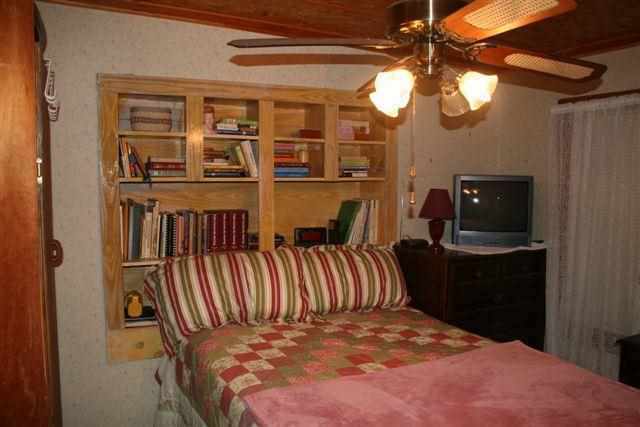
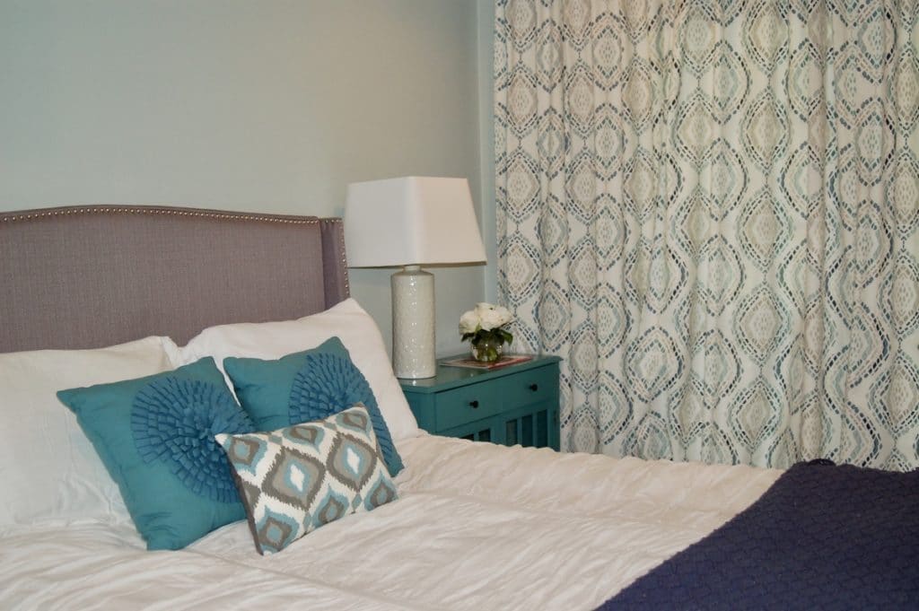
The master bedroom stayed the same size but we removed the bookshelves, sheetrocked the ceiling and added french doors that open to the front porch to make it feel a little bigger. The wall color is Sea Salt by Sherwin Williams. Drapes from West Elm and the white ruched duvet from Pottery Barn finish the room.
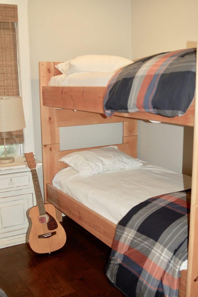
The boys bunk room was originally a large side porch. We shrunk the porch and stole space from the storage area to make it a bedroom that easily fits two sets of bunk beds from Furniture in the Raw. White coverlets and plaid duvets from Pottery Barn Teen to give it a masculine feel.
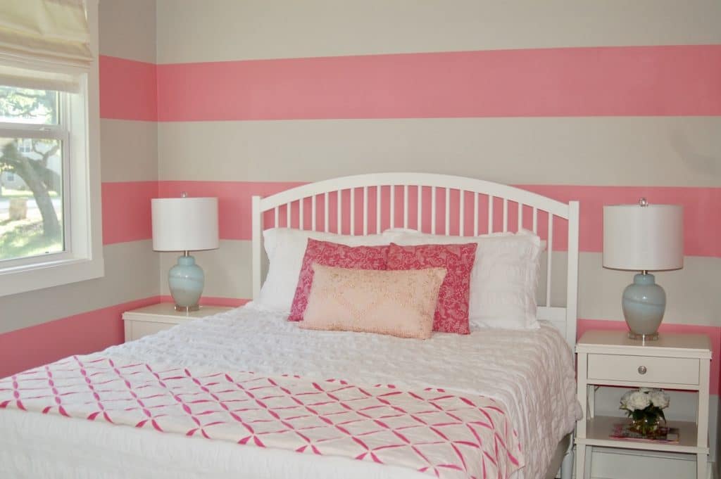
We turned the old workshop into the girls bedroom by adding some windows, a closet and air conditioning. My daughters wanted pink walls so we compromised and did a pink and white stripe.
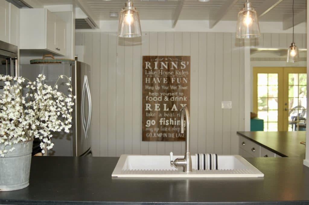
We love our little lake house. It is perfect gathering place for friends and family to unwind, relax and get inspired. As a reminder to all of our guests we had this sign made:
I loved this remodel, not only because it was our lake house but because I enjoy making things beautiful. Do you want to make your home beautiful and inspiring? Sign up for a free 15 minute call and we can get started!

