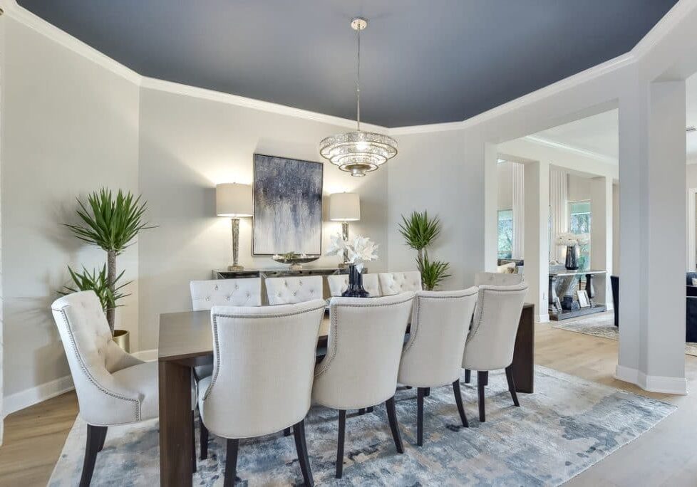
Every year Pantone announces it’s color of the year. It is usually a prediction of what color will be most popular in home decor and fashion. Sometimes they get it right and sometimes they get it wrong. But for 2020 Pantone says “Classic Blue” is the one and I think they got it right. This shade of blue is classic and timeless and therefore, in my opinion, deserves to be the color of the year. But I think navy blue should share the title because it is equally timeless and classic. Sherwin Williams Paint Store agrees. They are calling Naval (SW 6244) the 2020 interior design color of the year.
I have been using navy blue as a staple in my interior design for several years now. I live in Austin, Texas and I often meet with clients who are trying to leave the Tuscan brown trend (travertine floors, beige walls, brown speckled granite counters). For clients who can’t rip out their existing finishes, painting the walls a lighter, fresher color and bringing in navy blue helps create an instant update. H
A Few Examples of How to Integrate Blue Into Your Living Spaces
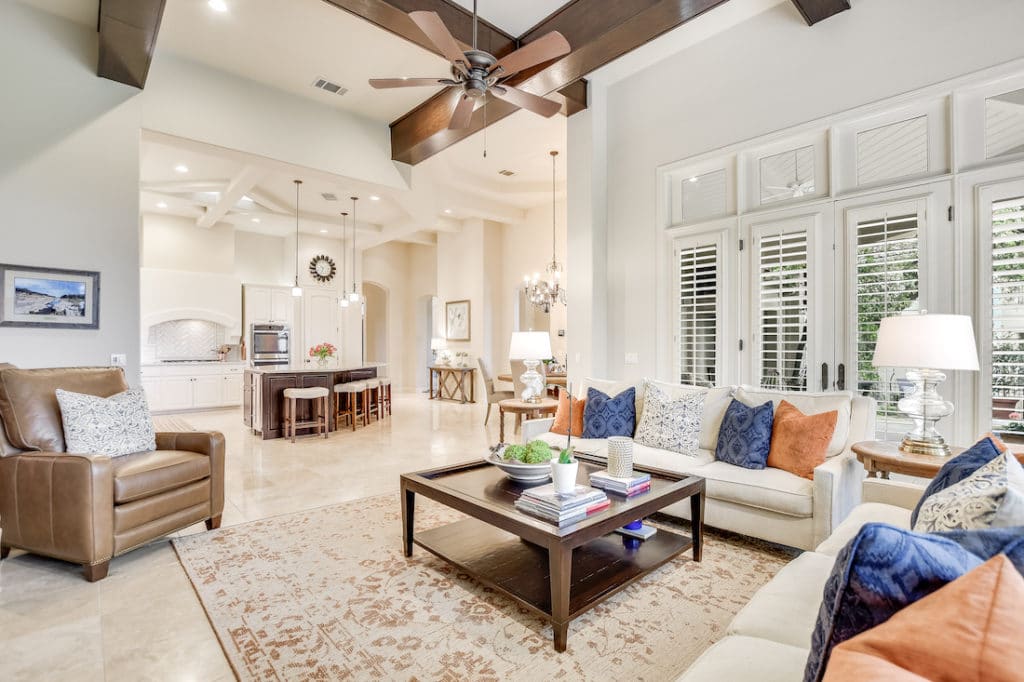
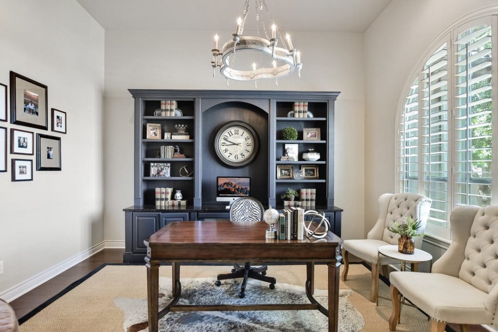
Navy blue plays well with browns and creams but also shines with white and gray as seen in the photo below.
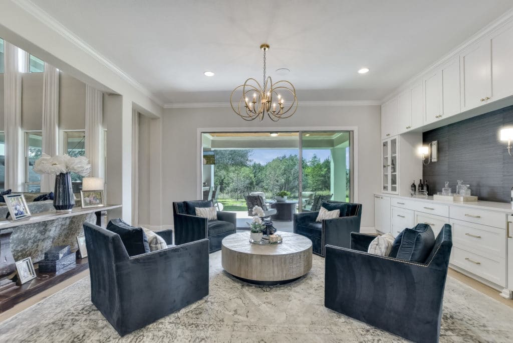
You could also pair blue with jewel tones such as teal for those who like more color.
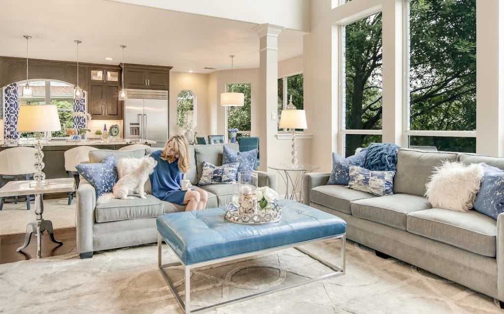
See the versatility? You can even use blue as a wall or cabinet color without fear of the color going out of style. But buyer beware. Not all navy blues are created equal. Some have purple undertones and even green undertones. For a true navy blue paint, use Sherwin Williams Naval or Benjamin Moore’s Hale Navy HC-154.
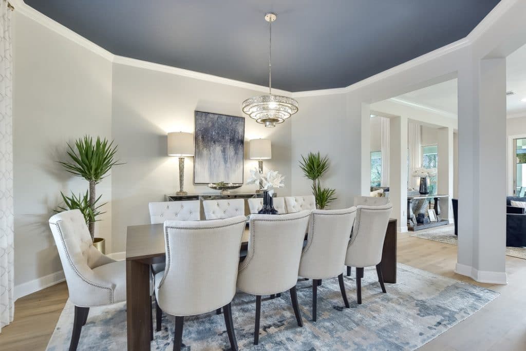
I love how this dining room turned out. The blue ceiling adds so much drama! Ceilings can look a little darker because there is less light reflecting off them, so instead of navy blue we went one shade lighter: Van Deusen Blue HC-156 by Benjamin Moore.
Feeling inspired but still a little unsure how to add blue to your interiors? Contact me here. I would be happy to help! Not a fan of blue? That’s okay too. I can work with all colors!

